Oct. - Nov. 2016
The North Carolina Museum of Natural Sciences is becoming more accessible and wants to reach a new audience. We present a unifying brand and design a system of promotional materials that enhance the entire museum experience.
TEAM
Nicole Ferreira
Marcie Laird
Matt Rogers
Nicole Ferreira
Marcie Laird
Matt Rogers
OBJECTIVE
How can we establish a comprehensive brand and promotional framework that enriches a target audience's museum experience?
How can we establish a comprehensive brand and promotional framework that enriches a target audience's museum experience?
CONTEXT
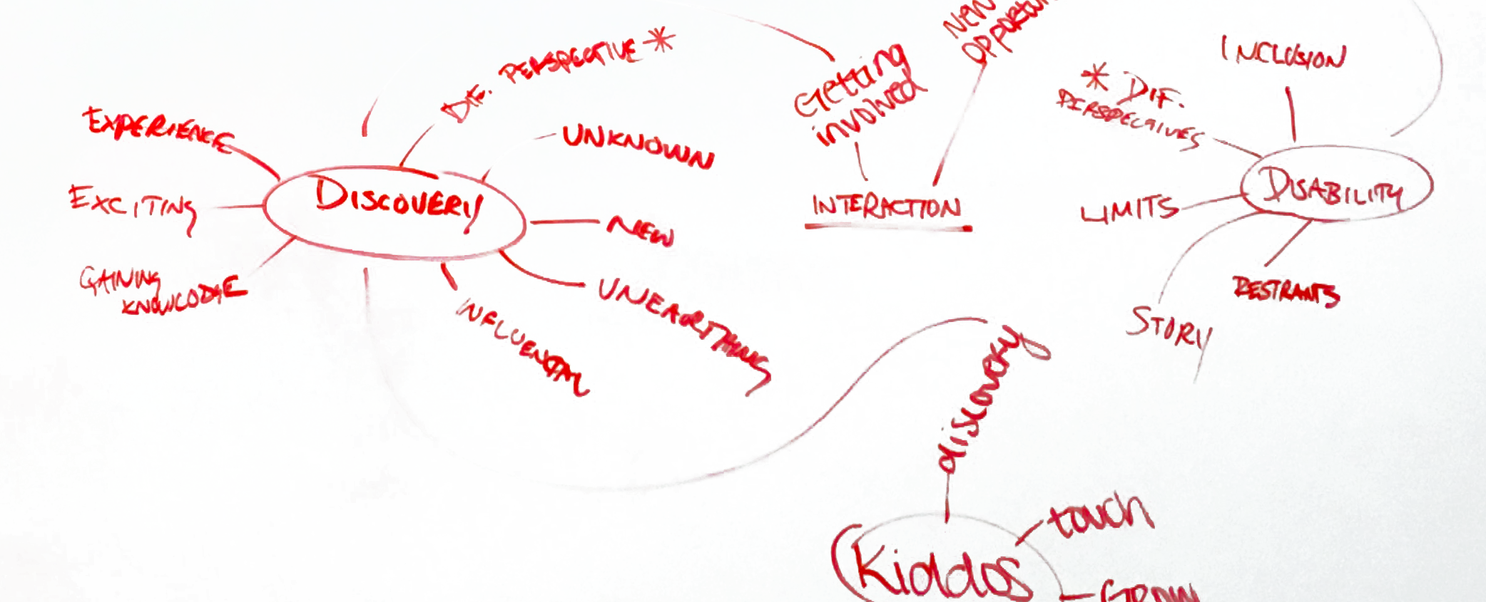
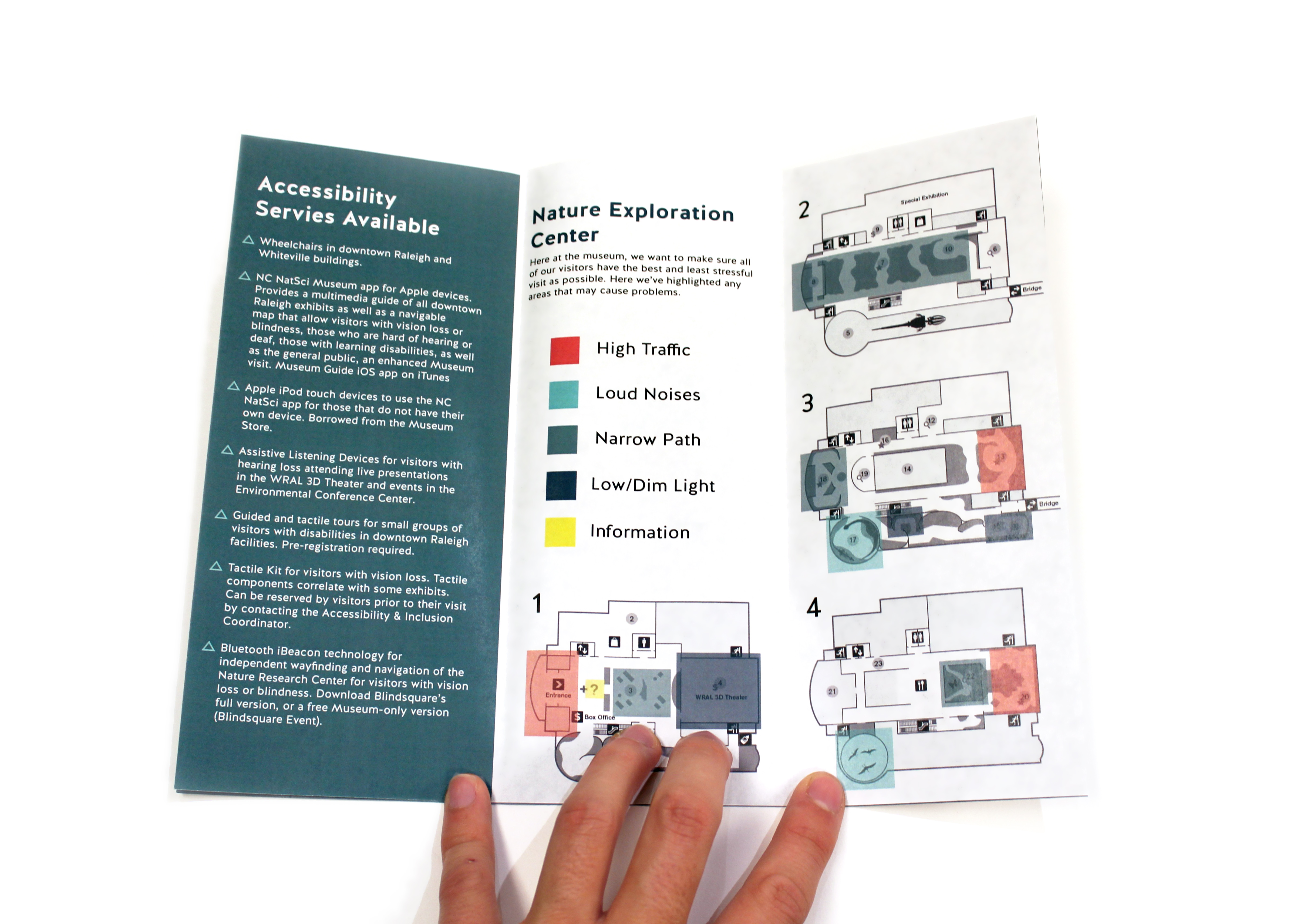
We began by working closely with the NCMNS to define their target audience. The museum wanted to appeal to the disabled community while also maintaining the interest to the stakeholders. They also expressed an effort to introduce issues of inclusion and awareness of ‘disability’ in the general public. Through a tour of the museum, we found that they already offered a wide variety of accessible services including: iBeacon integration for the blind, downloadable app for the deaf, and sensory map for the Autism Spectrum Disorder (ASD) community. We set out to design a brand and promotional structure that empowered the museum’s diverse audience through connotative and persuasive techniques rather than informational and type-driven ones.
An accessible foundation
We began by working closely with the NCMNS to define their target audience. The museum wanted to appeal to the disabled community while also maintaining the interest to the stakeholders. They also expressed an effort to introduce issues of inclusion and awareness of ‘disability’ in the general public. Through a tour of the museum, we found that they already offered a wide variety of accessible services including: iBeacon integration for the blind, downloadable app for the deaf, and sensory map for the Autism Spectrum Disorder (ASD) community. We set out to design a brand and promotional structure that empowered the museum’s diverse audience through connotative and persuasive techniques rather than informational and type-driven ones.
RESEARCH
Understanding the ADA
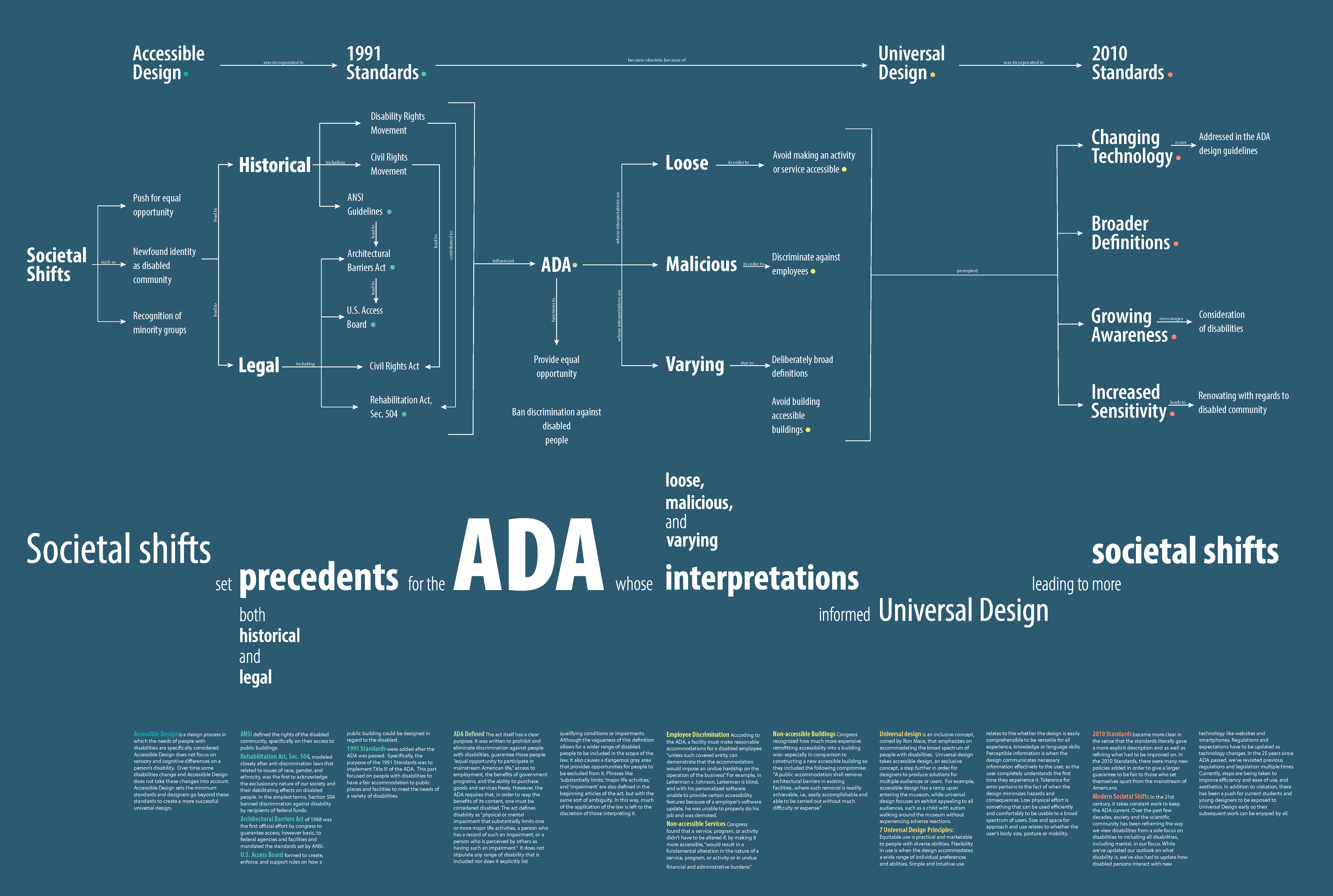
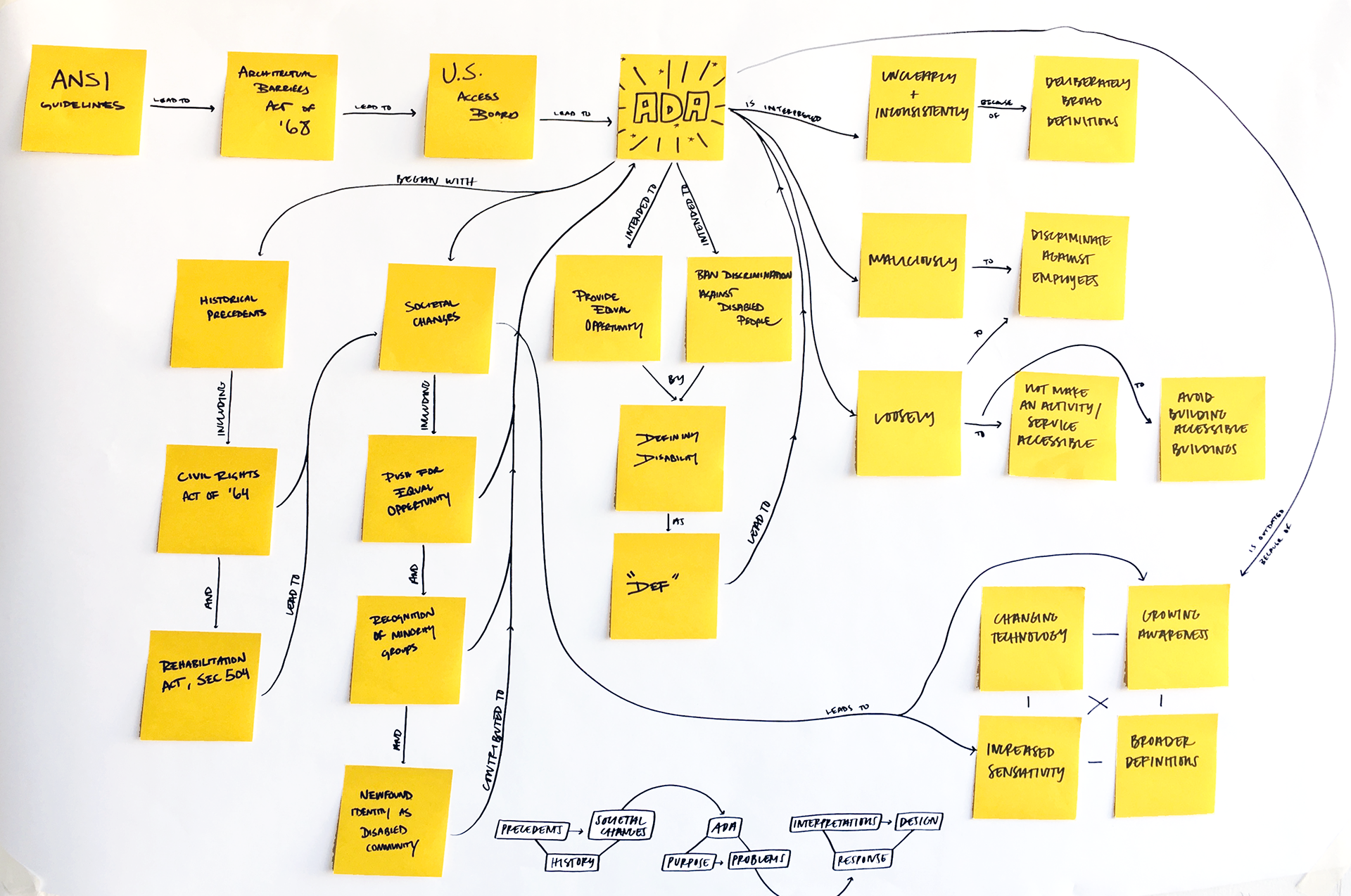
The Americans with Disabilities Act of 1990 set into motion a new era of accessible design throughout the nation. This civil rights law has a complex legal and social history that we set out to research, explain, and clarify. How can we simplify and explain an intricate narrative of legal, historical, and social significance to a variety of audiences. The system that I designed appealed to three different types of viewers: the passer-by, the light-reader, and the deep-reader.
Developing a strategy
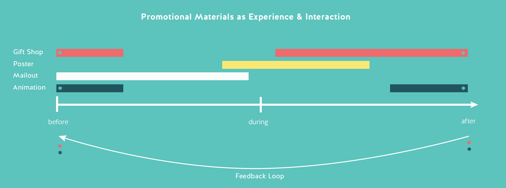
To establish a long-lasting impression on NCMNS's target audience we designed a timeline of integration through the entire visit. We formed user feedback loops recognizing the potential of promotional materials both within and outside of the context of the museum. Taking into account benefits of human-centered interaction and sensory stimulus to the experience of children with ASD, we emphasized physical & tangible interactions between the user and promotional materials and promotional materials within exhibit space. By not focusing our efforts just on potential customers but to current and past visitors as well, we open dialogue between the community and the museum which allows for a simpler, more effective method of attracting greater crowds to the space.
Building a brand
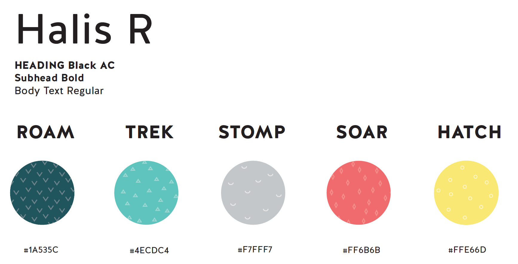
In order to create an eye-catching brand while still appealing to the ASD and disabled community, we crafted the color, pattern, and typography in tandem and maintained consistency through all of the created artifacts. We chose 5 distinct colors, patterns, and words to have variety and visual interest without losing sense of a unified brand. We decided to use short, bold, action words related to characteristics of dinosaurs as a means of speaking directly to users and relaying a message of empowerment. Each word references a different part of the museum experience while still hinting at the physicality of dinosaurs. Each word is paired with a corresponding pattern and color to create a visual system throughout all the pieces. The simple, yet reptilian patterns establish visual identity and unite different promotional materials.

FINAL PRODUCT
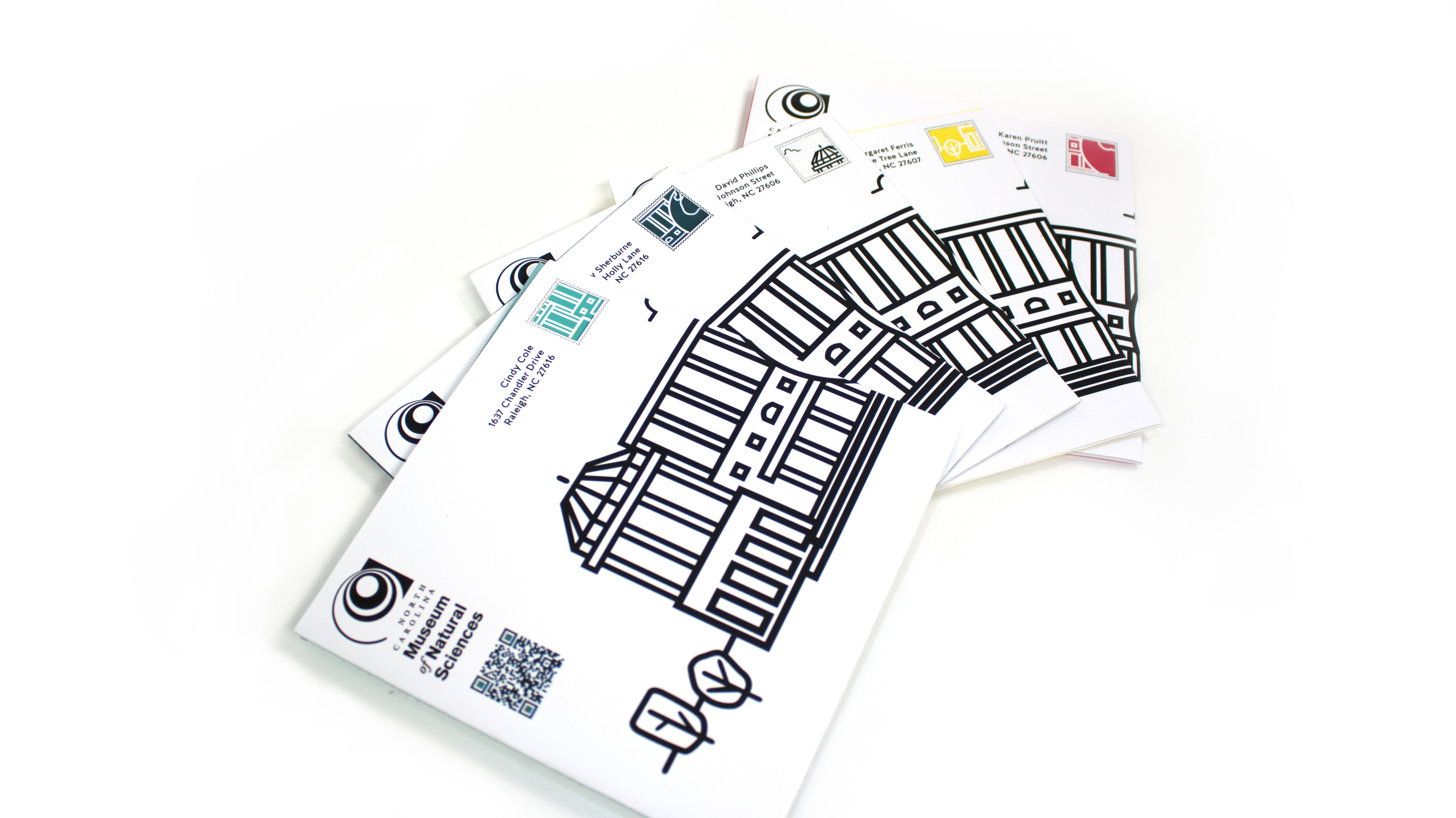
The first method of attracting new attention to the museum we designed was in the form of a mailer. This would provide potential visitors with information about the main dinosaur exhibit. The cutouts, bold graphics, and bright colors were intended to grab the attention of the receiver rather than being thrown away. This mailer was created in tandem with a participatory installation within the exhibit itself. The mailer included visual instructions and custom patterned paper in order to create your own origami dinosaur. My team and I figured that the main audience of a science museum, especially a dinosaur exhibit, would be children. This portion of the mailer would provide a way for children and the disabled community to interact with their parents or caregivers and further entice them to visit the exhibit together to complete the last step of adding it to the installation.
Mailer: Getting in touch
The first method of attracting new attention to the museum we designed was in the form of a mailer. This would provide potential visitors with information about the main dinosaur exhibit. The cutouts, bold graphics, and bright colors were intended to grab the attention of the receiver rather than being thrown away. This mailer was created in tandem with a participatory installation within the exhibit itself. The mailer included visual instructions and custom patterned paper in order to create your own origami dinosaur. My team and I figured that the main audience of a science museum, especially a dinosaur exhibit, would be children. This portion of the mailer would provide a way for children and the disabled community to interact with their parents or caregivers and further entice them to visit the exhibit together to complete the last step of adding it to the installation.

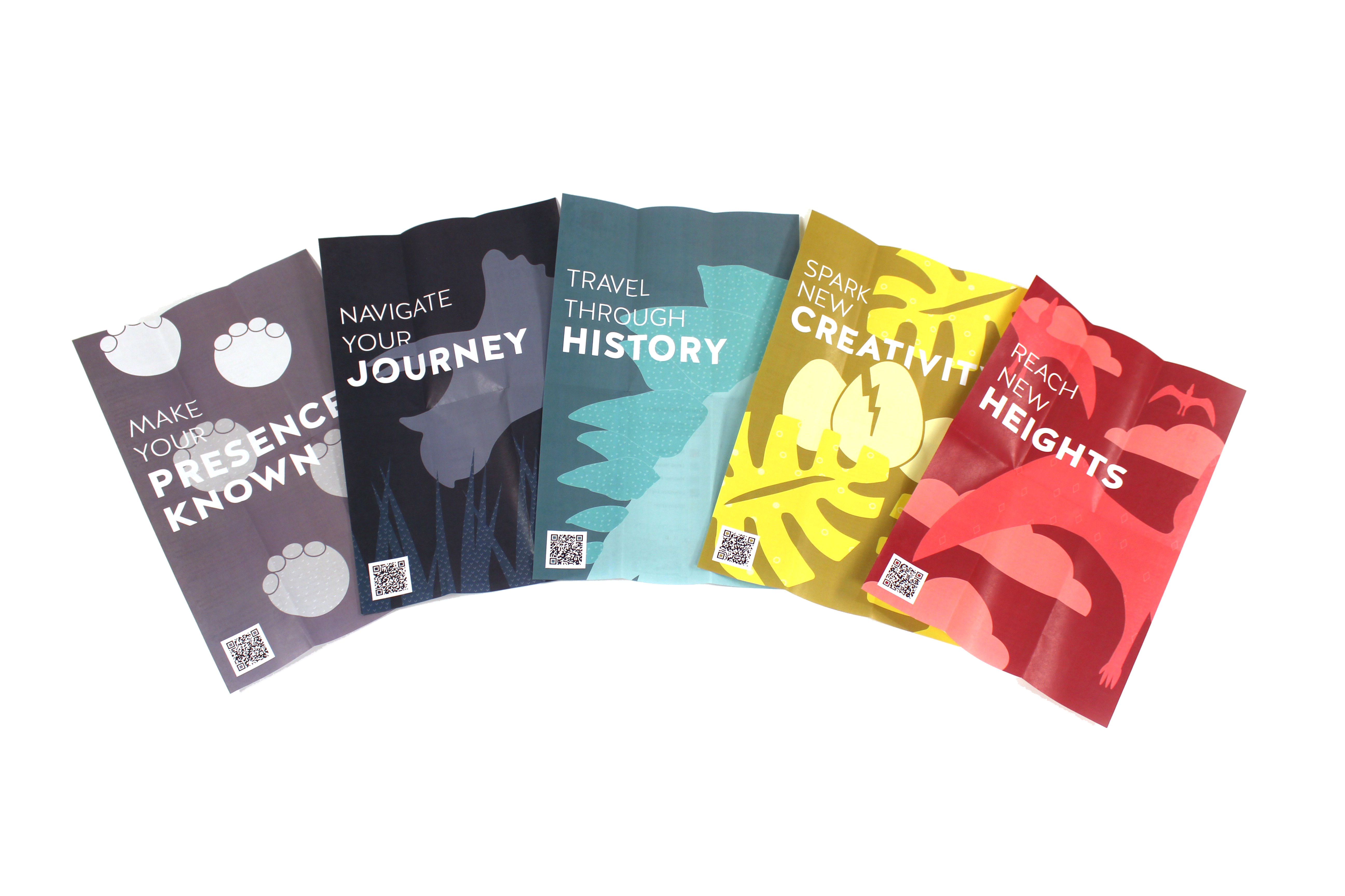
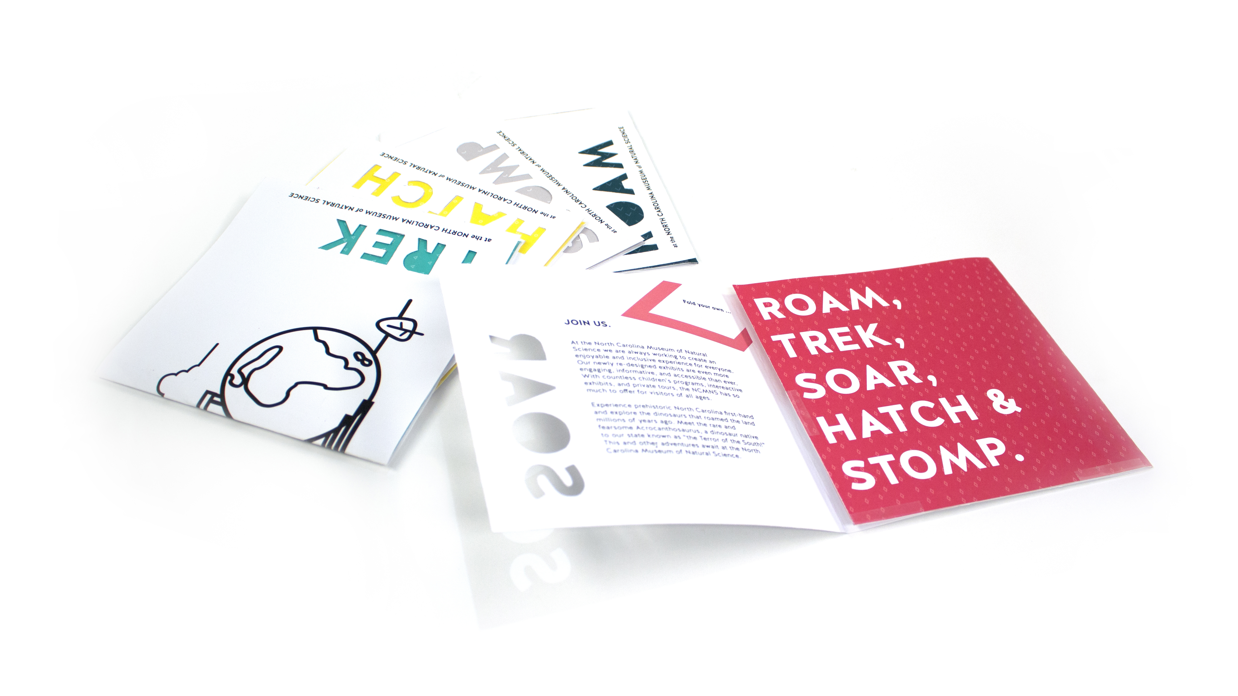
Brochures: Unfolding the journey
The branding and promotion seamlessly continued once the audience was in the museum. My team designed five distinct brochures to help guide different groups and show the large amount of services the museum offers. These brochure's topics and aesthetics fit naturally in the brand framework:
- ROAM, Travel Through History: map, attractions, and wayfinding
- TREK, Navigating Your Journey: accessibility information and accommodations for people with disabilities
- STOMP, Make Your Presence Known: community involvement, programming, and volunteer opportunities
- SOAR, Reach New Heights: educational programs, group tours, and school opportunities
- HATCH, Spark New Creativity: children’s programs, party hosting
To extend their use outside the experience of the museum, the brochures unfolded to reveal a full size poster. This made them more sought after as a collectible which, in turn, gave more information to the visitor. This feature was also intended to extend the lifetime of the artifact into the lives of the visitors outside of the museum. By giving a poster to another person or hanging it on a wall, it reminds people of their good experience and inspires other prospective visitors to go to the museum as well.

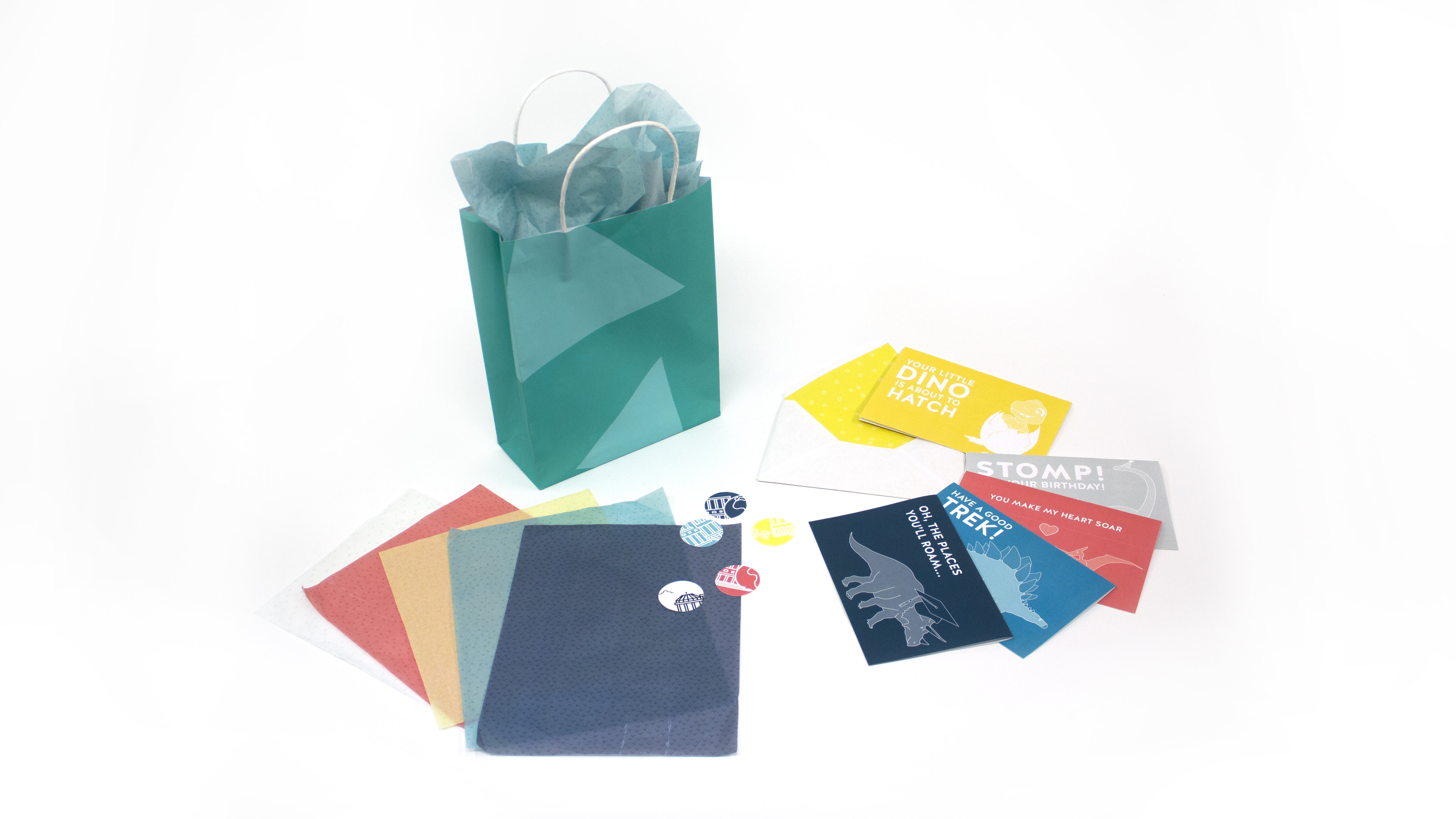
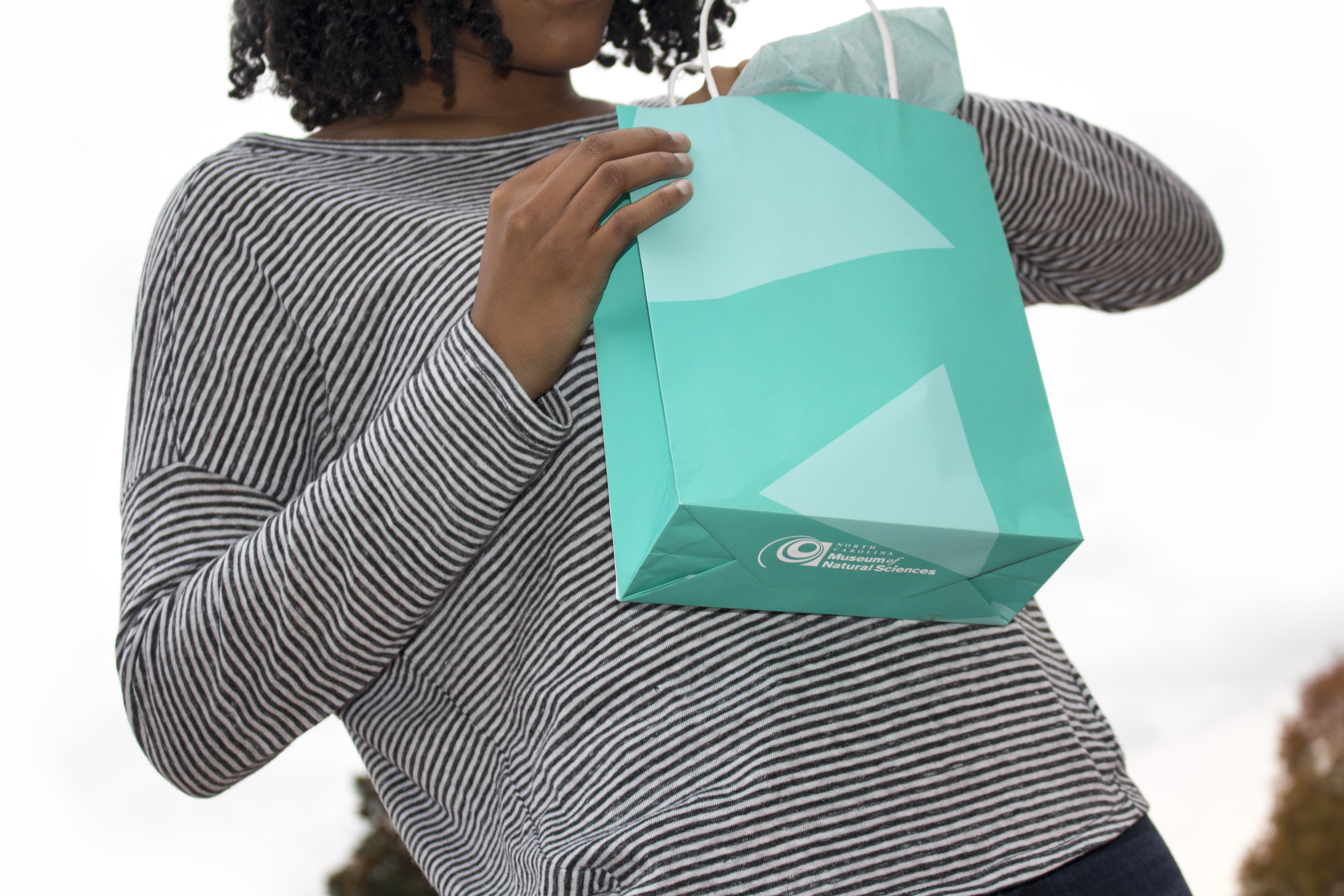
Merchandise: Wrapping it up
NCMNS original products and their packaging were also considered in our design framework. All artifacts fit into the branding whole while maintaining usability and aesthetic value. Gift wrapping supplies: bags, tissue paper, stickers, etc. were kept simple and graphic by adjusting pattern scale and repetition. The eye-catching nature of the paraphernalia grabs attention and attracts more potential visitors.


Animations: sticking out
The final element in the timeline we designed to be more widespread and attract people beyond past museum visitors. Customers were given stickers with the museum branding and QR codes that they could independently disperse. This could be placed on their own personal belongings, such as water bottles or laptops, or placed in public spaces for everyone to see. This creates a semi-permanent advertisement that, when in the hands of the customers, can be spread far beyond the typical reach.
When someone, whether it's a passer-by or targeted audience member, scans the QR code on their phone or tablet a whimsical animation plays representing both the museum and the possibility of five different dinosaurs interacting with it. The variety of potential animations encourages viewers to watch and share all of them and further extend the brand retention rate.

Down to earth
These designs were presented in front of the North Carolina Museum of Natural Sciences' main staff. You can read about the collaboration my group had with the graphic design seniors and our joint presentation here.
Our team's individual brand and promotional work along with the research into the American's with Disabilities Act was highlighted in the STEM Career Showcase of Students with Disabilities featuring Dr. Temple Grandin.